“An object should be judged by whether it has a form consistent with its use.”Bruno Munari – Artist
Clear and simple geometries
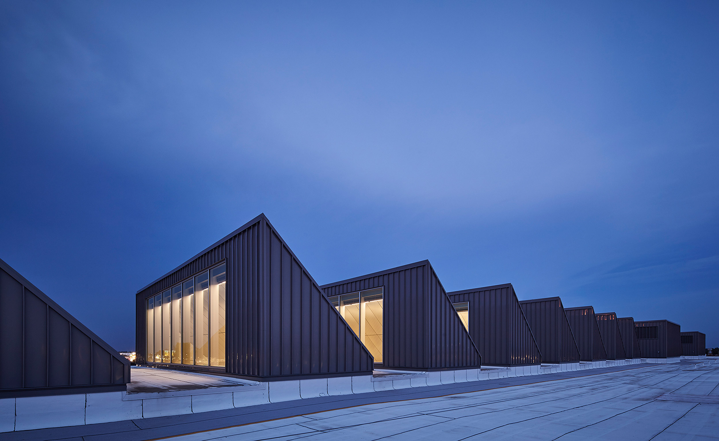
Main buildings forms should be compact and with simple and clear geometries, which respond to the functional organization. Homogeneous appearance will emphasize this quality; facades should be not over articulated or expressive.
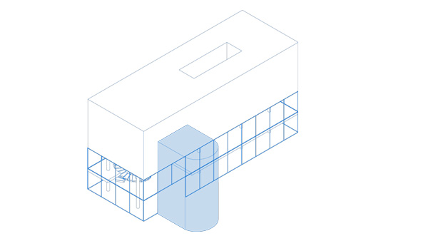
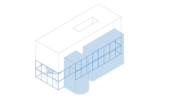
Secondary elements should appear differentiated and not integrated into the main building volume, not to detract from the clarity of the volume. They can be expressed in a distinct architectural language to clearly show their purpose.
- Design timeless, primary shapes and volumes that can be clearly read and that respond to their functional organisation.
- Additional connecting volumes and infrastructure elements supporting existing buildings should:
- Be visually differentiated from the original volume by means of materiality, scale, and form. - - Have a size corresponding to their function.
- Offer clear modular lines and a notion of rigor should be reflected in the design.
- Be either integrated or treated as adjacent to the main building volume.
Don’t
-

Additional elements should not be the protagonists; they are supportive to the main building. Avoid odd and extravagant geometries that make them overly remarkable.
-

Geometry should not be complex or fragmented by integrating secondary elements into the main building volume.
Key to Pure volumes
- Design timeless, primary volumes that can be clearly read and respond to their function.
- Any infrastructure or connecting elements should be visually differentiated from the main volume.